January 2, 2011
Questions to the Firefox 4 UI team (FFb8)
Obligatory description of complainant: web user since 1994, Mozilla user since the Mozilla Suite point releases and before that Netscape 1+, web developer of 15 years, currently teaching web tech skills, programming and visual design. Not a noob to UI design (history in desktop app dev) and typically an advocate of minimalism.
- Why did you remove the status bar to recover vertical space then immediately replace it with a taller addon bar missing the absolutely critical feature of showing the link target? Jenny Boriss’ post on this contains some extremely flimsy rationale for a change that affects hundreds of millions of people who’ve been looking in the status bar link target for 15+ years. At the absolute minimum, include a ‘link target’ draggable in the Customise Toolbar box that can be placed on the left side of the addon bar. Also see this petition to bring it back.
- WTF did you do to the JS alert() and prompt() dialogs? Why aren’t they platform dialogs any more? Is this a hack around the app-modal problem? They’re intensely ugly on WinXP at least and just look like part of the page. You may think that’s a good thing, but I certainly don’t.
- Why does the addon bar have a close button, yet no other toolbars do? Why is there no option to remove it? Dragging it off like any other feature doesn’t do anything. I love having to resort to userchrome hacks.
- Never auto-combine buttons on the menu bar (Stop and Refresh) according to some arbitrary rule that the user doesn’t know. The toolbar editor is intended to be as close to WYSIWYG as possible, and any changes should have clear reasoning or rationale. BTW, why do the Refresh & Stop buttons combine when placed in that order, and not Stop + Refresh? This is how I’m working around the auto-combine at the moment.
-
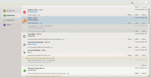
The entire — and I’m not kidding — addons manager is horrible. Unlike almost everything else that’s part of the browser itself, it’s eschews the standard platform UI feel and colours for some webpage mishmash. To be specific:
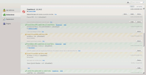
- The whole design feels flat. Medium grey text on light grey background with light grey blue lines. Subtle grey crosshatching all over the place makes it look dirty.
- Is is much too wide on a decent screen. One of the benefits to the old addon manager, although it’s obvious that you didn’t see it this way, was that the addons manager was independent of the browser window’s size. There was never a need to maximise the addon manager, because it was just a simple list with a couple of buttons that lead to a modal dialog box or a link. Addons don’t need 1650 pixels to display two sentences of information.
 As a side effect of making the manager so large, now it’s totally bloody overwhelming on load (Jesus, just used the new prompt() again to insert that link. The text box is too small and it feels totally wrong.) You’re showing too much on a normal desktop screen, so for a user like myself with ~35 addons the list can’t be scanned or parsed. You’ve successfully turned a simple list into a mega full-screen application that’s too visually large to conceptualise as a list and now it’s scary to work with.
- The addon list feels like it has arbitrary backgrounds assigned to each addon; it’s not clear from a glace what’s disabled, what’s broken, what’s working, or what’s just been updated because of the similarity of each. Also, diagonal lines are always a bad idea for sitting behind text, even if they’re subtle. I believe you’re better off breaking this list into two, possibly three: enabled, disabled and broken. The list will be much more readable and scannable at a glance.
 Warning or information messages for each addon are hard to read due to colour and shadow effects and hard to scan because they’re badly placed. This is an extension to the problem above. Can you find a better, more vertically scannable place for this if the other issues aren’t fixed?
- I don’t believe we gained anything by integrating the Addons website into the manager. Clicking an addon opens another tab anyway, so it’s just an arbitrary stepping-stone portal/start-page. You’re still installing addons via an app-modal popup which can sometimes take 10 seconds to appear while the browser lets me click around and change tabs (that in particular has confused me many times, sometimes making me think the click hasn’t registered, and I’m an advanced user for christ’s sake).
- Non question: while the UI team is focussed on reducing browser chrome, it’s wasting huge amounts of screen on whitespace in the addons manager. Take a look at the screenshot linked above. Underneath the fake “tabs”: huge waste of space. The entire search bar (which is also practically invisible up there): huge waste of space. Each addon in the list: criminal waste of both vertical and horizontal space. Yes, I understand and respect the use of whitespace. I believe the addon manager is overdoing it though.
- So much effort has been put into getting tabs against the top edge of the screen in order to benefit from Fitt’s Law or some derivation thereof but inexplicably the addon list scrollbar isn’t against the edge of the screen. Why? When did you last see a full-page scrolling list inset from the side of the screen?
- Why is the addon manager a normal tab instead of being an app tab? This results in it getting lost within other tabs, like it’s some random web site instead of being a browser configuration window.
- Why do addon icons automatically inherit a button-like border? I thought we were going for minimalist, and this certainly isn’t.
- In one recent Test Pilot study you found that many people have large amounts of tabs open. Widescreen is becoming the dominant screen ratio. Why wasn’t a vertical tab list option developed to compensate? You’ve just pissed a lot of people off by removing 23 pixels of status bar, implementing tabs-on-top by default and (worse) drawing app contents in the OS-reserved title bar but there’s no option for vertical tabs that would restore space taken by chrome? I would have thought this would be a top priority. Ideally, Firefox would watch the number of tabs the user has over a few sessions and offer to demonstrate the vertical tab alignment with an easy way to switch it back.
- Why does the bookmarks bar automatically turn off when upgrading from 3.6 if a user has stuff there? I have common sets of pages in folders up there, as does my partner, my mother, my sister, and many technically-minded people I work with. The only reason I can imagine for this is to futher reduce vertical chrome, but annoyed users will just turn it back on again anyway! And if I didn’t know how to turn it back on, well, I’d be really frustrated at having lost all that stuff.
- Aside: Firefox Sync is a nice idea, but I wouldn’t have a clue what it does if I wasn’t a Mozillian. The Set Up Sync option gives no details whatsoever. Where you do explain it, make sure to pimp the “encrypted, and even Mozilla can’t read it” side, because I see that as a big selling point over any solution that Google or MS may provide in the future.
Edit 1:44am: fixed incomplete sentence; killed silly exaggeration, rephrased some statements into questions and corrected Jenny Boriss’ name.
One thought on “Questions to the Firefox 4 UI team (FFb8)”