August 25, 2007
Super Street Fighter II Turbo HD Remix impressions
My first impressions of the SSFII remix came from photographs of a Capcom presentation back in April. Wow! Ryu looks really good, even if they did modify his face to be more anime/SFAlpha-like.
Ken’s first sprite release was the iconic fireball pose. I thought it was decent enough, but the arms needed some work—more like rope than muscles—and his thumbs gained an extra joint or two.
Akuma took the muscled look a bit too far, but the style was still impressive. I’m not sure what the deal is with the flat bladed elbows, but I wasn’t very fond of the original SSFII Akuma sprite and this was an overall improvement.
Guile wasn’t so crash hot. It was our first hint that not all Udon artists are created equally. Dark spots for eyes, simplistic shading and horribly inaccurate musculature. His face didn’t quite fit either, and the age-old sprite-mirror problem was particularly evident with the flags on his arms.
A re-imagining of Chun Li’s defeat-screen animation came next. I wanted to like it, but the nagging voice insisted there was something wrong. Someone in the blog comments pointed out that she was sniffing her hand more than dabbing her tears. Follow that with a comparison shot of the original animation (with completely different facial proportions) and a comment mentioning bukakke and that was it for Chun Li’s new animation.
T‑Hawk, a character I’ve never been completely convinced about. There was a lot of discussion on his first frame release. Everything was happy-la-la until someone realised his head had been transplanted from another artist’s work drawn years ago. It’s fine to be inspired from other artists; pasting parts directly on and then changing half the sprite in order for it to fit decently is another thing. There are plenty of things wrong with this sprite that the new detail-work can’t cover up, including an unnatural upper-body twist, a head that’s not scaled correctly, and shoulder and head positions that don’t reflect any of T‑Hawk’s original imposing posture.
Splayed throughout the blog posts on the site are my criticisms, questions and suggestions. I tried to avoid the “monkey flinging poo” style of commenting so popular on the blog (while cringing at the unwarranted fanboy arse-kissing). Through the comment shitstorm many reasonable questions didn’t get answered, but the pragmatic part of me understands a conservative management’s unwillingness to give one person the reins to a title’s marketing, especially in the direct company of the great unwashed.
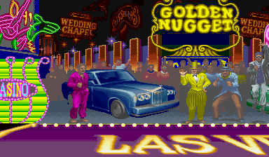
After the T‑Hawk debacle Brian (the poor guy shouldered with the blog) focussed on Super Puzzle Fighter II X HD Remix for a while (which comes with its own collection of low development budget issues). Many, like me, were hoping for a re-post of updated characters now that we’d made our opinions known. Instead, after weeks of waiting, we got this:

Compare to the original SSFIIT stage:
Or even better yet, the original darker SFIIT version:
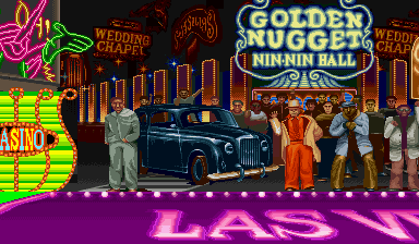
Style-wise, the last one is the best of the lot. There’s a visual richness that was lost with the SSFIIT change, and the new hires version takes even more away with flat, washed-out colours (too much midtone) and poor lighting (way too much bloom). There’s scaling problems (that must be an extremely short or underage generic bikini-clad girl) and the background characters are drawn so bluntly that they look like extras from a low-budget Nickelodeon cartoon.
Apart from the stylistic changes which I dislike, the increased detail and overall brightness introduce a level of visual noise that could make stages such as this difficult to play on. Halfway down the blog a helpful chap named Coyote links a photoshop mockup he put together using the background and prototype sprites:
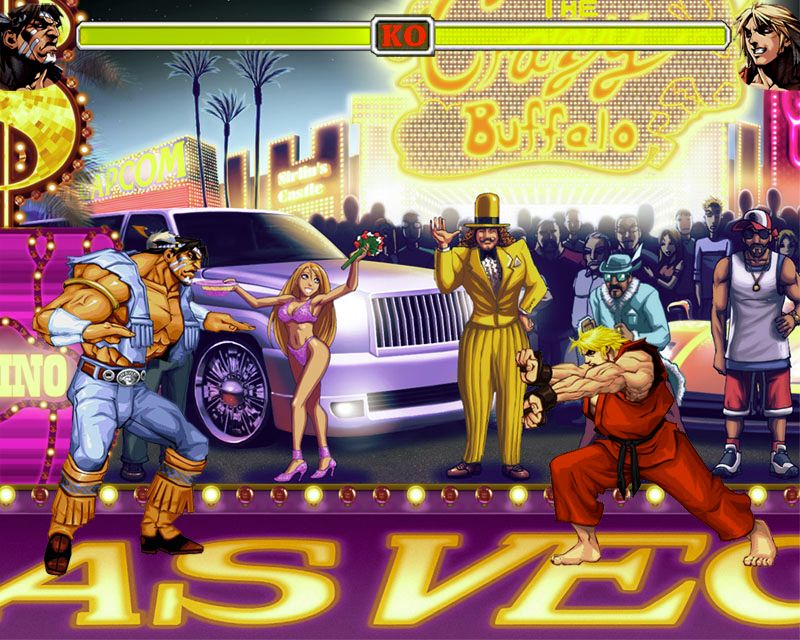
Not jumping to conclusions based on an unofficial mockup, but if that’s a rough indication of what the final game will look like, then either the background detail will need toning down or a stronger colour contrast between foreground and background must be introduced.
Gotta go!